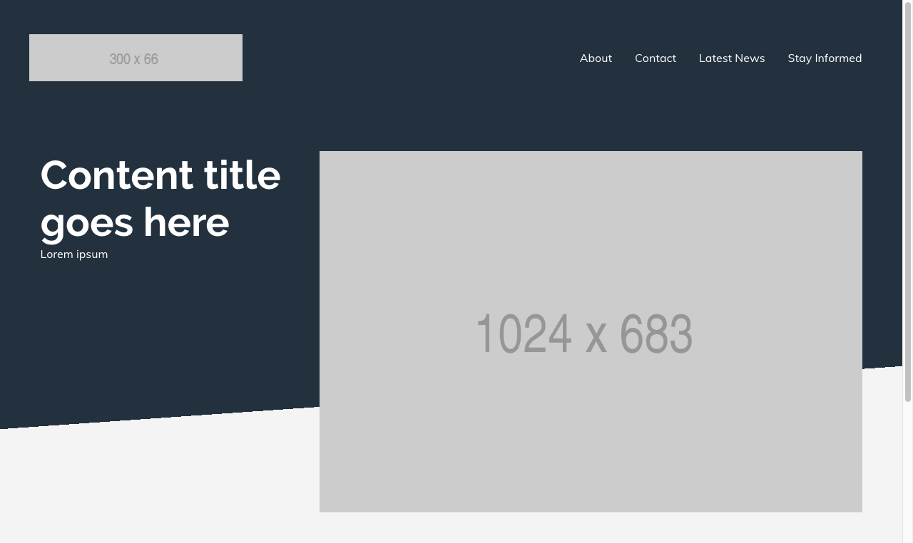
February 4, 2018
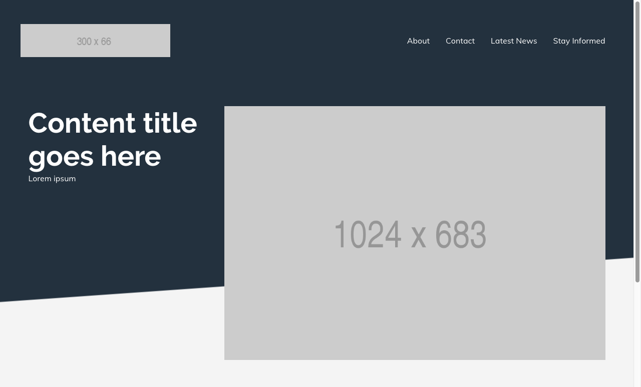
The design specs for a new WordPress theme I’m building call for an angled background:
This one took awhile to figure this one out so — to borrow a classic tech blog motto — I’m writing the post I wish I had found when I started down this path.
My initial searches of how other people have solved this led to a lot
of recommendations of stuff like transform, skewY, clip-path,
and psuedo-selectors.
While it was fun to kick the tires on some of the new, advanced features CSS has developed in recent years, each attempt either ended with a ton of code smell or I would discover browser support was limited and therefore not a viable solution.
I decided to scrap all the advanced trickery and return to basics.
The thing I’m working on is a background, therefore I decided to focus
on the CSS background property. Is there a widely-used background
property which starts as one color and finishes as another? Why, yes
there is: linear-gradient().
I first put together the most basic gradient I could think of, just to
guage viability of using linear-gradient() for this.
background-image: linear-gradient(to bottom, #22313F, #F4F4F4):
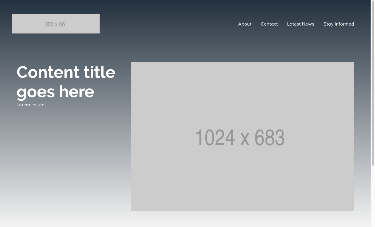
Not bad! The color proportions are off, the angle is wrong, and the transition is too gradual — but this was offering the best solution yet.
The first change I made was to have the dark blue extend further down.
A percentage or length after a color tells the gradient that the color should reach its apex at that position.
background-image: linear-gradient(to bottom, #22313F 70%, #F4F4F4):
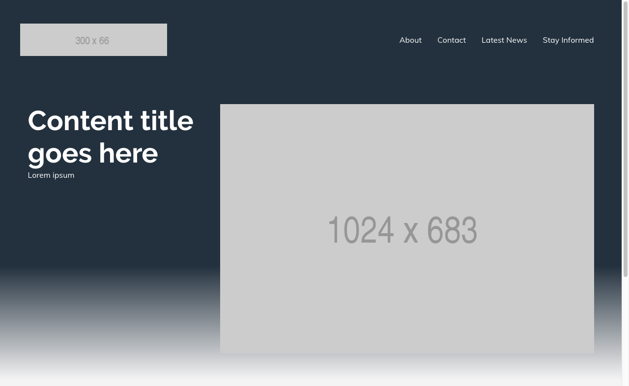
With 0% being the start of a background, and 100% being the end of a background.
This tells the gradient to blend from the starting color until 70% of
the background has been covered at which point #22313F is at its
apex.
This achieved the desired effect because the first color is also the starting color, leading to the solid color at the top (which I wanted).
The next color in the list, #F4F4F4 starts at 70% and reaches its
apex at 100% (hence why it is less solid than the dark blue.)
Still need to sharpen that dividing line, but it’s coming along.
The second change I made was to have the angle slightly tilted.
background-image: linear-gradient(176deg, #22313F 70%, #F4F4F4):
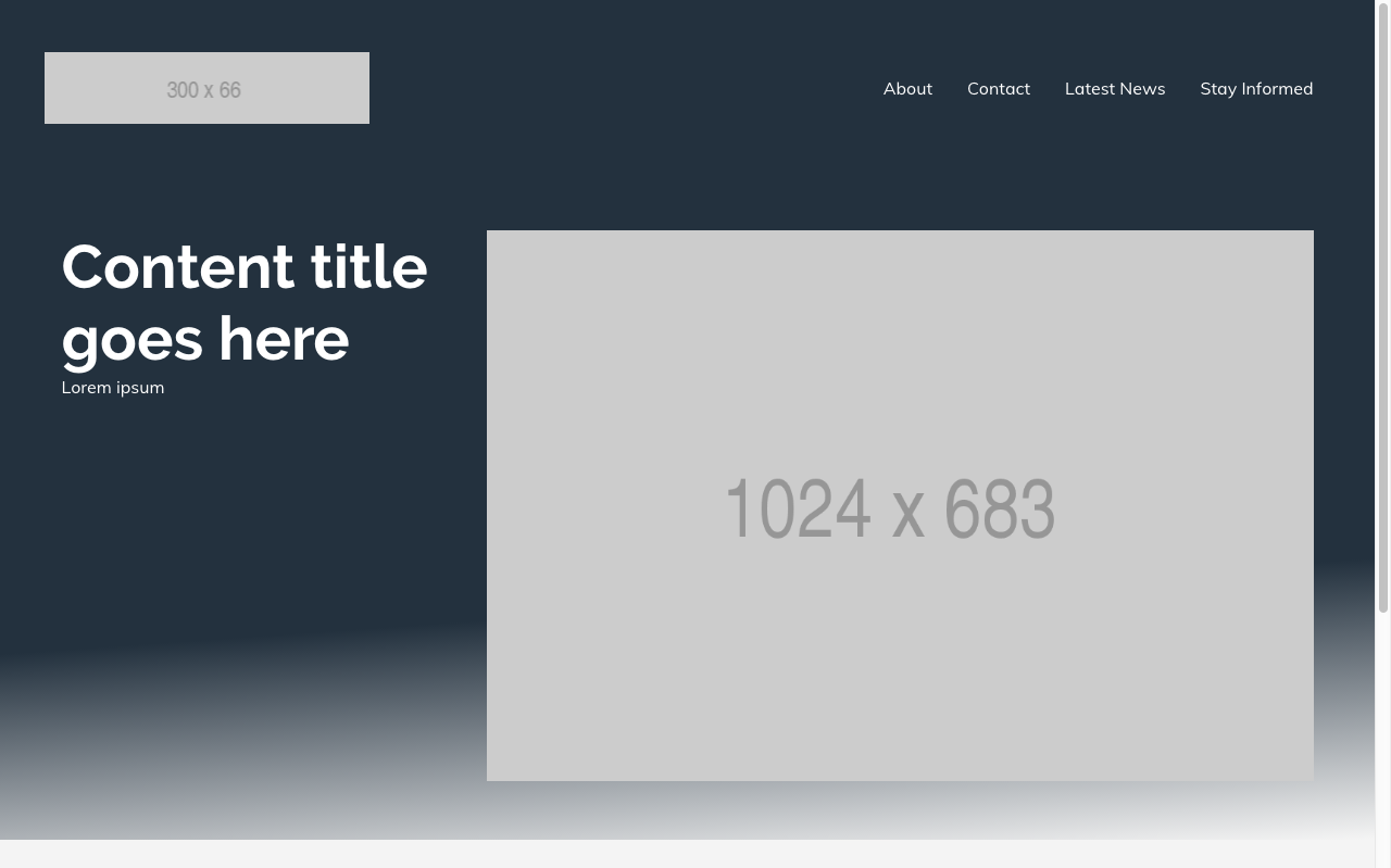
“to bottom” is equivalent to 180deg and from there it was just a
matter of finding an angle that matched the spec.
Getting a sharp transition between the two colors took the longest time to figure out.
Everything clicked once I realized I just needed the apex of #F4F4F4
to also occur at 70% of the background image. That way it would be a
solid color (#22313F) from 0% to 70% and another solid color
(#F4F4F4) from 70% to 100%.
background-image: linear-gradient(176deg, #22313F 70%, #F4F4F4 70%):
So close! But those jagged edges obviously wouldn’t fly so I had to keep at it.
I eventually stumbled upon a Stack Overflow answer that provided the missing piece.
background-image: linear-gradient(176deg, #22313F 70%, #F4F4F4
calc(70% + 2px))
:
The reason calc(70% + 2px) worked while 70% didn’t is that 70%
provided absolutely zero gradation between the two colors.
What calc(70% + 2px) provides is a very, very small amount of
gradation between the two colors which the eye perceives as a sharp
transition without it being jagged.
So #22313F starts at 0% and reaches its apex at 70%. Then, #F4F4F4
reaches its apex at 70% plus two pixels and continuing to 100%.
So those there is still a gradient — it’s just a two pixel gradient from dark blue to light gray.